Hey, guys! Today, we’re talking about scatterplots and how to interpret them. 📈
How Do You Interpret the Type of Association Between Variables in a Scatterplot?
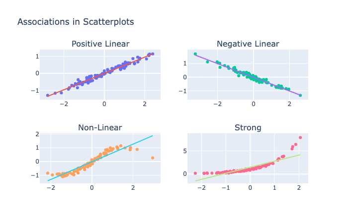
A scatterplot is a graph that shows the relationship between two variables. The type of association between the variables can be positive, negative, linear, non-linear, strong, or weak. 🔍
- A positive association means that as one variable increases, the other variable also increases.
- A negative association means that as one variable increases, the other variable decreases.
- A linear association means that the relationship between the variables is straight and consistent.
- A non-linear association means that the relationship between the variables is curved or irregular.
- A strong association means that the variables are closely related, while a weak association means that the variables are not closely related. 📊
For example, if you were looking at a scatterplot that shows the relationship between hours of sleep and Grade Point Average (GPA), a positive association would mean that students who get more sleep tend to have higher GPAs. A negative association would mean that students who get less sleep tend to have higher GPAs. A linear association would mean that the relationship between hours of sleep and GPA is straight and consistent. A non-linear association would mean that the relationship between hours of sleep and GPA is curved or irregular. A strong association would mean that the variables are closely related, while a weak association would mean that the variables are not closely related. 📈
What Do the Shape and Tilt of the Cloud of Points in a Scatterplot Describe?
The shape and tilt of the cloud of points in a scatterplot describe the strength and direction of the relationship between two variables. 🔍 If the cloud of points is tilted upward from left to right, then there is a positive association between the variables. If the cloud of points is tilted downward from left to right, then there is a negative association between the variables. The shape of the cloud of points can also indicate whether the association is linear or non-linear. 📊
A trend line is a straight line that represents the overall pattern in a scatterplot. You can draw a trend line by visually estimating the line of best fit or by using a regression analysis to find the mathematical equation of the line. 🧐 The line should be drawn so that it passes through the middle of the cloud of points and captures the overall trend of the data. 📈
So there you have it, guys! To interpret a scatterplot, look at the type of association between the variables (positive, negative, linear, non-linear, strong, or weak). The shape and tilt of the cloud of points describe the strength and direction of the relationship between the variables. And to draw a trend line, estimate the line of best fit or use regression analysis to find the mathematical equation of the line. 📊🧐📈
