Hey, friends! Today, we’re talking about multivariate graphs and when it’s best to use them. 📈
Multivariate graphs are data visualizations that show the relationships between three or more variables in a dataset. These graphs can be used to explore complex data sets and identify patterns and relationships that might not be immediately apparent from a simple scatterplot or line chart.
When Is it Best to Use Multivariate Graphs?
Multivariate graphs are best used when you want to visualize broad trends and patterns across many variables and when you want to show as much information as possible. 🔍 For example, if you’re studying the relationship between diet, exercise, sleep, and overall health, a multivariate graph could help you see how all of these variables are related to each other. 🥗🏃♀️💤🩺
What Are Examples of Multivariate Graphs?
There are many examples of multivariate graphs, including conditioning plots and scatterplot matrices.
- A conditioning plot helps you explore the relationship between two variables as a third variable changes.
- A scatterplot matrix is used to explore three or more continuous variables by looking at variables two at a time. 📊
Conditioning Plot
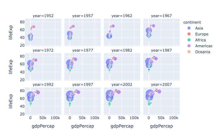
For example, let’s say you’re looking at a conditioning plot that shows the relationship between the Gross Domestic Product (GDP), life expectancy, and continent population. You could explore how the relationship between GDP and life expectancy changes over time. Alternatively, a scatterplot matrix could be used to look at the relationships between hours of sleep, minutes of exercise, and daily calorie intake. 📈
Scatterplot matrix
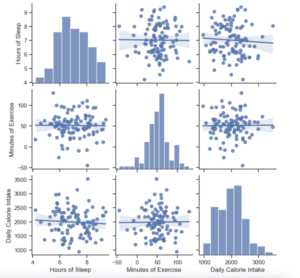
The diagonal of a scatterplot matrix shows histograms that depict the univariate distribution for each variable. It gives you a sense of the data distribution for each variable on its own. 📊
When using a scatterplot matrix, it’s important to limit the number of variables to fewer than 10, because as the number of variables increases, the number of scatterplots in the matrix increases exponentially. It can become difficult to interpret and make sense of the data. 🔍
So there you have it, friends! Multivariate graphs are best used when you want to visualize broad trends and patterns across many variables, and examples include conditioning plots and scatterplot matrices. 📊🤓🔍