An essential aspect of data storytelling is sequential highlighting. This technique helps create engaging and easy-to-understand visual narratives to illustrate data stories effectively.
Sequential highlighting involves walking your audience through layers of a data story by gradually revealing information.
We’ll start by setting the foundation, describing the context and chart scaffolding to the audience, and then highlighting specific visual elements and data points relevant to our story. Let’s dive into the process step by step.
Step 1: Set the foundation
Before we begin highlighting our data, we should have a solid foundation, which includes the context and chart scaffolding. The context allows the audience to understand the background, while the chart scaffolding provides a visual structure for the data. For example, suppose we want to tell a story about the relationship between a country’s Gross Domestic Product (GDP) per capita and happiness levels using data from the World Happiness Report. In that case, we must first set the stage by introducing these two variables and explaining why they are of interest.
Step 2: Highlight specific visual elements
Once we have set the foundation, it’s time to highlight the important visual elements and data points. To do this, we need to identify the crucial parts of our data story that we want our audience to pay attention to. Using the previous example of GDP and happiness, we could emphasize the countries with high happiness scores and GDP per capita to show a positive correlation between economic development and well-being.
Step 3: Gradually reveal the data story
Instead of bombarding our audience with all the information, we can gradually use sequential highlighting to reveal our data store. This allows for a more engaging experience and helps the audience better understand and retain the information. For example, we can start by discussing the correlation between GDP and happiness in general, move on to specific countries, and finally look at outliers and exceptions.
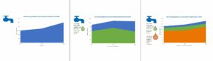
One effective way to implement sequential highlighting is to use small multiple charts.
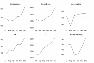
These are essentially mini-charts that break down complex data into easy-to-digest panels. They allow our audience to process information more efficiently, as we can provide explanations and interpretations for each panel, just like a comic strip.
For instance, let’s think about how this applies to discussing the relationship between GDP and happiness using small multiple charts. First, we can divide our data into different income groups, such as low, middle, and high-income countries. A separate panel can represent each group.
Next, we can explain specific group stories using these individual panels. In each panel, we can identify factors contributing to overall happiness and point out any outliers or exciting trends.
In conclusion, sequential highlighting helps us create engaging data stories by walking our audience through the data layer by layer. Using small multiple charts effectively implements this technique, allowing us to break complex information into more straightforward and more manageable narratives.