Have you ever heard the saying, “A picture is worth a thousand words?” This principle applies to data visualization as well. Our brains are much better at processing and understanding visual information compared to text or numbers. Therefore, a well-designed visual narrative can communicate large amounts of data quickly and effectively, allowing us to analyze and make informed decisions based on that data.
Let’s look at an example. Imagine you are given a large spreadsheet filled with endless rows and columns of numbers related to your company’s sales data. It would be challenging for anyone to make sense of such information. However, if you were to represent the same information visually through a bar chart or a line graph, patterns would emerge, trends could be identified, and the overall story behind the data would become much clearer.
Furthermore, when communicating with others, especially when it comes to decision-making, it’s vital to present data in a way that’s both easily understandable and compelling. Visual narratives are an excellent tool for achieving this, as they can help grab the audience’s attention, convey complex ideas with clarity, and persuade by presenting data-driven evidence.
Consider action movies. You might have noticed that they often use visual cues, like maps or schematics, to convey important information. This strategy can simplify complex situations for the audience, allowing them to easily follow the story.
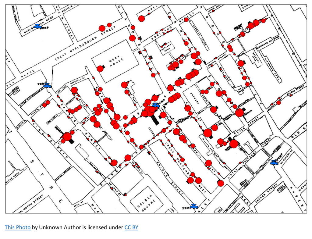
Visual narratives can reveal patterns we would never have detected by looking at raw data alone. For example, the iconic map-based visualization of cholera cases in 1854 London by physician John Snow allowed him to trace the outbreak to a specific water pump, improving sanitation and public health. This story is an excellent example of how a visual narrative can yield valuable insights.
Here are four key factors in creating effective visual narratives:
-
- Choose the right visuals: Select the most appropriate chart or graph type to represent the data effectively. For example, bar charts are excellent for comparing individual values, while line charts are apt for showing trends over time.
- Simplify and focus on what’s important: Remove any unnecessary elements and guide your audience’s attention to the most important aspects of the data.
- Make it accessible: Ensure that your visual narrative can be easily understood by a broad audience, including those with visual disabilities, by using clear labels, legends, and appropriate colors.
- Add context: Provide explanations and insights to help your audience understand the data and its significance.
Avoid these common mistakes:
-
- Overwhelming the audience with data: Presenting excessive amounts of data without proper context or organization.
- Failing to define a clear narrative structure: The story can become disjointed and difficult to follow without a clear narrative structure.
- Lack of storytelling techniques: Data alone can be dry and unengaging. Effective data narratives incorporate storytelling techniques to make the information more relatable and compelling.
- Ignoring the target audience: Failing to understand the audience’s level of data literacy, background knowledge, and information needs can result in a narrative that is either too simplistic or too complex for them to understand.
- Lack of visualization or ineffective visual representation: Poorly designed or ineffective visualizations can hinder the audience’s ability to grasp the insights hidden within the data.
- Neglecting the context and limitations of the data: Data narratives should provide the necessary context and acknowledge the limitations of the presented data. Failing to do so can lead to misinterpretation or misunderstanding of the information.
In conclusion, visual narratives play a critical role in data storytelling and communication. They allow us to comprehend complex information better, engage audiences, and persuade through data-driven evidence. By incorporating well-designed visual narratives into our work, we can leverage the power of visuals to tell compelling stories and make better decisions.
