Explanatory elements are crucial for enhancing a viewer’s understanding of the data story you’re presenting in your visual narratives. Elements include messaging, observations, and commentary.
Here are some factors to keep in mind when creating and applying such elements:
- Clarity and simplicity: Always strive to provide clear and simple explanations. Avoid using jargon or technical terms that may be unfamiliar to your audience. Instead, write explanations in plain and accessible language that everyone can understand. For example, instead of writing, “The percentage of individuals over the age of 65 in rural areas is increasing at an alarming rate,” you could say, “More and more people over 65 are living in the countryside, which could lead to challenges in healthcare and social services.”
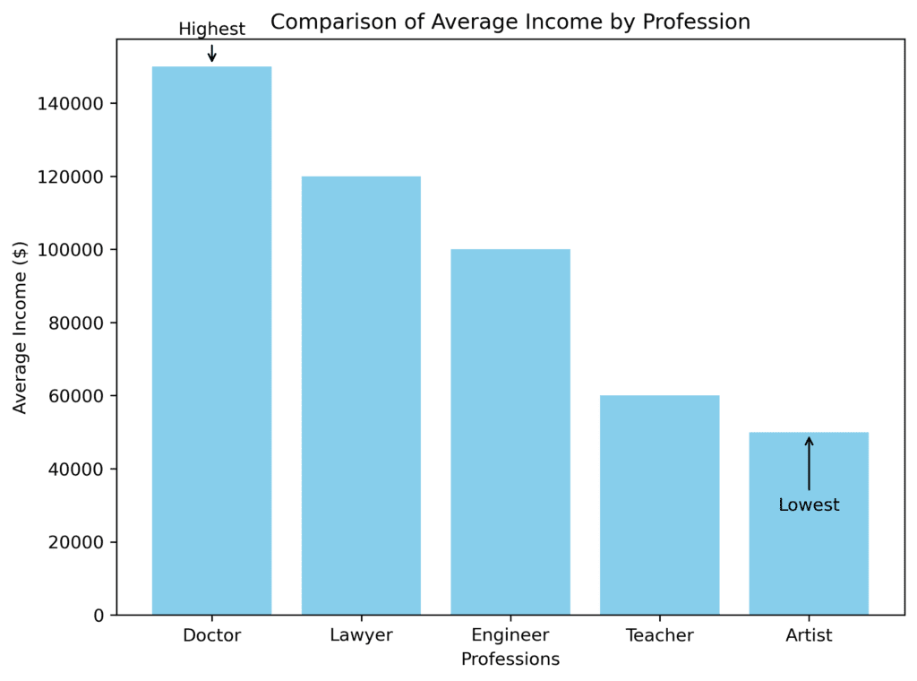
- Use concise labeling and annotations: Labels and annotations are essential for identifying key data points, trends, and patterns in your visuals. Make sure your annotations are brief, relevant, and informative. For instance, if you show a bar chart comparing the average income of different professions, you can annotate the highest and lowest bars to highlight the disparity.
- Consistent and legible typography: Choose a font style and size that are easy to read and consistent across all visual narrative elements. Stick to one or a small selection of complementary fonts to maintain a coherent and professional appearance.
- Use storytelling techniques: Like any other story, your visual narratives should have a beginning, middle, and end. Start by introducing the story’s context and purpose, then show how the data supports your observations or conclusions, and finally, provide a summary or recommendations based on your findings. This will help guide your audience through your data story logically and engagingly.
- Combine text, visuals, and multimedia elements: To create a more immersive and engaging experience, consider integrating multiple formats in your visual narratives. Use text for explanations, charts or graphs for presenting data, and images or videos to depict real-world examples or scenarios.
- Highlight the key insights: Emphasize the most important findings or messages using color, bold text, or size variations. This helps your audience quickly grasp what’s most important in your data story.
- Use a logical layout and flow: Organize your visual narrative in a way that makes sense and allows your audience to follow along easily. You could use a linear layout that your audience reads from top to bottom or guide them through a series of visuals connected by arrows or lines.
- Test and iterate: Finally, don’t forget to test your visual narrative with a small group of people who fit your target audience. Gather their feedback and refine your design and explanations until it becomes clear, engaging, and easy to understand for everyone.

