The following discusses various design techniques to help viewers track their progress through a data storytelling visual narrative. These techniques provide structure and guidance, support feelings of accomplishment, and make the experience more engaging and enjoyable. Let’s explore some of these design techniques together:
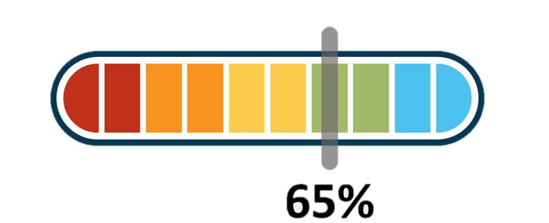
Progress Bar
This is a simple yet effective way to show how much of the story has been completed. A progress bar can be displayed at the top or bottom of the screen, filling up as the viewer moves through the narrative. For example, in a data story about global warming, a progress bar could represent the years from the early 1900s to the present.
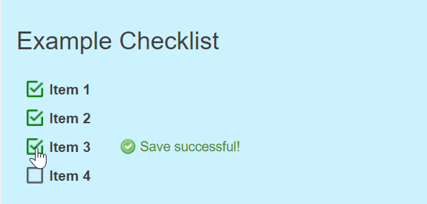
Checklists
Checklists offer a more detailed way to track progress. They can be used to break down a data story into smaller tasks or milestones, which the viewer can check off as they complete. For instance, in a data story about a company’s growth, a checklist might include milestones like “Reached 100 employees,” “Expanded to new regions,” and “Launched new product line.”
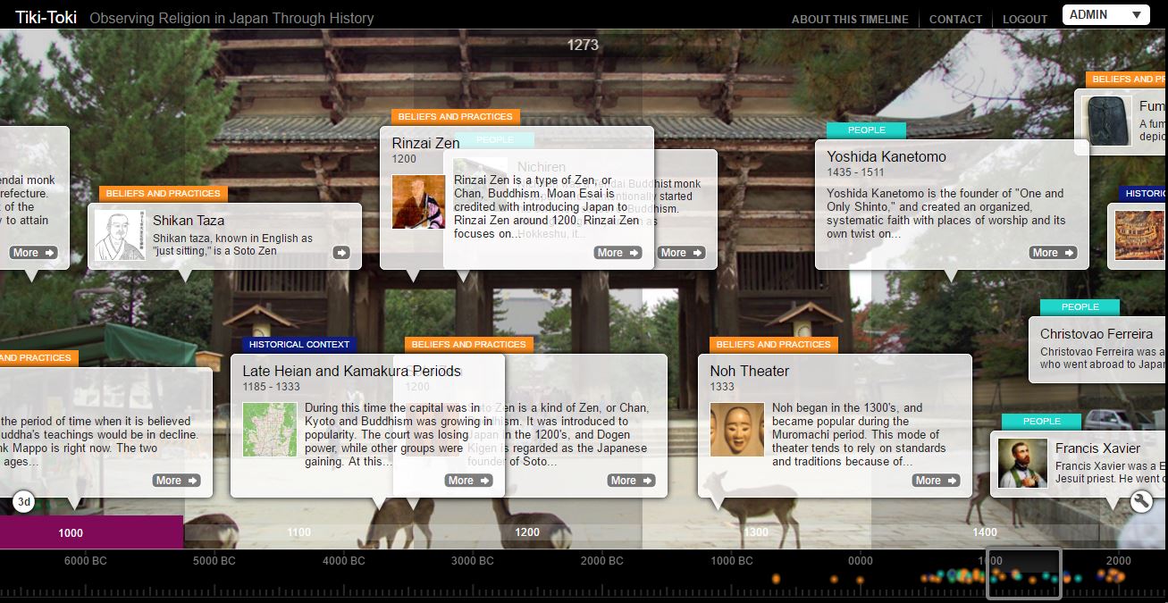
Interactive Timelines
Timelines visually represent events that happen over time. By making them interactive, viewers can click on specific points in the timeline to learn more about each event. This allows them to see their progress as they move through the story. In a data story about the history of space exploration, an interactive timeline could highlight key events, such as the first human spaceflight, the moon landing, and the Mars rover missions.
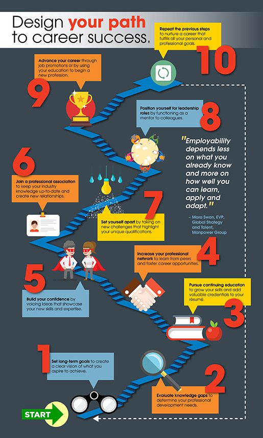
Numbered Steps
Breaking the data story into numbered steps is another excellent way to help viewers keep track of their progress. Each step can represent a different topic or data point within the narrative. For example, in a data story about the benefits of a healthy lifestyle, numbered steps could cover topics like exercise, diet, sleep, and stress management.
Visual Signposts
Visual signposts are crucial in guiding the viewer’s attention and emphasizing key points within the narrative. They include elements like icons, color coding, contrast, and imagery that can direct and focus the viewer’s journey through the data story. For instance, using distinct icons to represent different data types or highlighting key findings in a contrasting color can help viewers quickly grasp the story’s structure and main points.
Using these design techniques, you can make your data storytelling visual narrative more engaging and easier to follow for your viewers. Remember, the key is guiding them through the story in a clear and organized manner while providing a sense of progress and accomplishment.