In this article, we’re going to explore different types of bar charts, which are super useful for understanding and comparing data. Let’s dive right in and learn about these cool charts using some everyday examples!
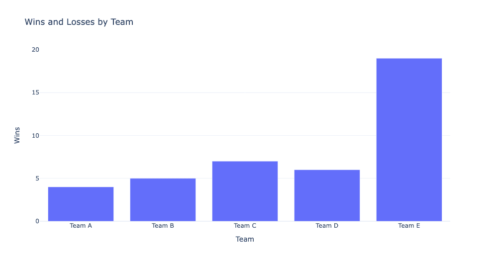
Bar Chart: Picture your favorite sports team’s wins throughout a season. A bar chart is perfect for this scenario. It has horizontal bars representing categories (in this case, the teams), and the length of each bar corresponds to a value (the number of wins). This makes it super easy to compare the performance of different teams at a glance!
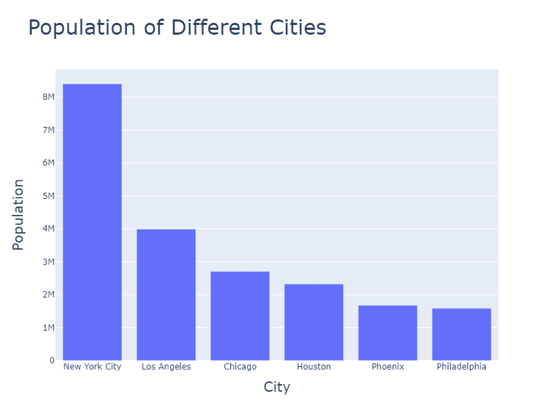
Column Chart: Now, imagine you’re reading a blog post about the population of different cities. A column chart is just like a bar chart but with vertical bars instead of horizontal ones. So you’d see a vertical bar for each city, with the height representing the population size. This lets you quickly spot the most populous cities and those that are not as crowded.
Bar (horizontal bars) and column charts (vertical bars) are suitable for comparing discrete categories or groups, such as:
- How do different categories compare in terms of a specific metric (e.g., sales, revenue, or number of users)?
- Which category has the highest or lowest value for a given metric?
- How do the values of different categories rank or compare against each other?
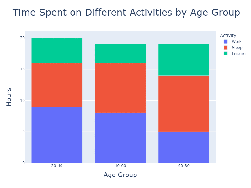
Stacked Bar Chart: Let’s say you come across a news article discussing how many hours people spend on different activities like work, sleep, and leisure. A stacked bar chart would be ideal for this! It’s similar to a regular bar chart, but the bars are divided into segments, with each segment representing a category (e.g., work, sleep, leisure). This way, you can easily see the total amount of time spent and how it’s distributed among different activities.
A stacked bar chart helps answer questions about the composition of multiple data series, such as:
- How do different subcategories (e.g., product types, age groups, or regions) contribute to the total value of each category?
- Which subcategory has the largest or smallest contribution to the total value within each category?
- How does the composition of different subcategories vary across the main categories?
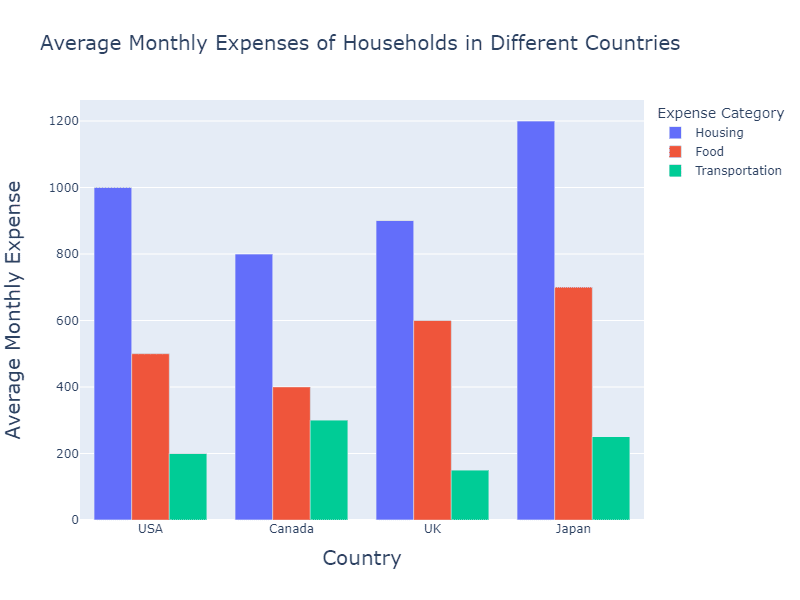
Grouped Bar Chart: Picture a social media post about the average monthly expenses of households in different countries. A grouped bar chart consists of multiple bars for each category (countries in this case), each representing a sub-category (housing, food, transportation, etc.). By comparing these bars side by side, you can easily see how expenses vary across countries and which components contribute the most to overall costs.
Grouped bar charts can help answer questions about the comparison of multiple data series across categories, such as:
- How do the values of different subcategories (e.g., product types, age groups, or regions) compare within each main category?
- Which main category has the highest or lowest value for each subcategory?
- Are there any trends or patterns in the data series across the main categories?
100% Stacked Bar Chart: Imagine a blog post discussing the market share of different smartphone brands. A 100% stacked bar chart displays the relative proportions of categories (smartphone brands) as segments within a bar, with the total bar height always equaling 100%. This allows you to see the percentage contribution of each brand to the overall market, making it easier to understand their popularity.
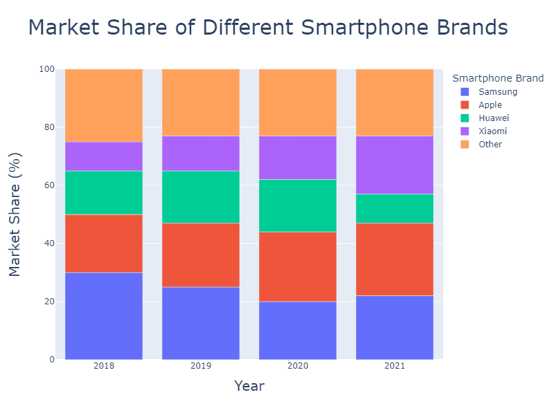
These charts are useful for answering questions related to the relative proportions of different subcategories, such as:
- What is each main category’s percentage breakdown of different subcategories (e.g., market share, revenue distribution, or user demographics)?
- How does the relative proportion of each subcategory vary across the main categories?
- Are there any trends or patterns in the percentage distribution of subcategories across the main categories?
Lollipop Chart: Picture an infographic about the number of coffee shops in different neighborhoods. A lollipop chart is similar to a bar chart but with a twist: each bar is replaced by a line with a circle (the “lollipop”) at the end. This visually appealing chart type helps you easily compare the number of coffee shops in various areas and spot the most caffeinated neighborhoods!
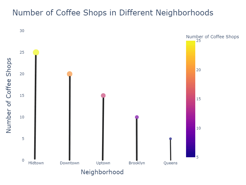
Lollipop charts can help answer questions such as:
- How do different categories compare in terms of a specific metric (e.g., sales, revenue, number of users)?
- Which category has the highest or lowest value for a given metric?
- How do the values of different categories rank or compare against each other?
These different types of bar charts can help you make sense of data in various real-world situations, whether it’s sports, population, or even your daily routine.