A density plot is a graphical representation of the distribution of a continuous variable. It helps to identify patterns, trends, and the underlying structure of the data. There are a few different types of density plots: 1-D density plot, 2-D density plot, and contour plot. Let’s explore each one.
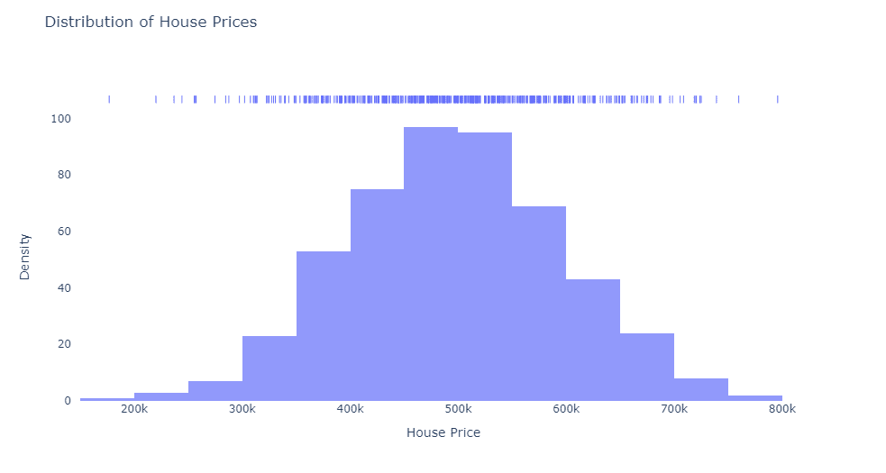
1-D Density Plot: A 1-D density plot, known as a Kernel Density Estimate (KDE) plot, is a smoothed histogram version. It shows the probability density of a single continuous variable. For example, imagine you’re reading a news article about the distribution of house prices in a city. A 1-D density plot could show you the range of prices, how common each price is, and if there are any clusters of prices.
To visualize this concept, think of a horizontal axis representing house prices and a vertical axis representing the number of houses. The 1-D density plot would be a smooth curve that peaks where house prices are most common.
A 1-D density plot can help answer questions related to a single continuous variable, such as:
- What is the distribution of a specific variable, like house prices or test scores?
- Are there any modes or clusters in the data?
- Can we identify any outliers or unusual values?
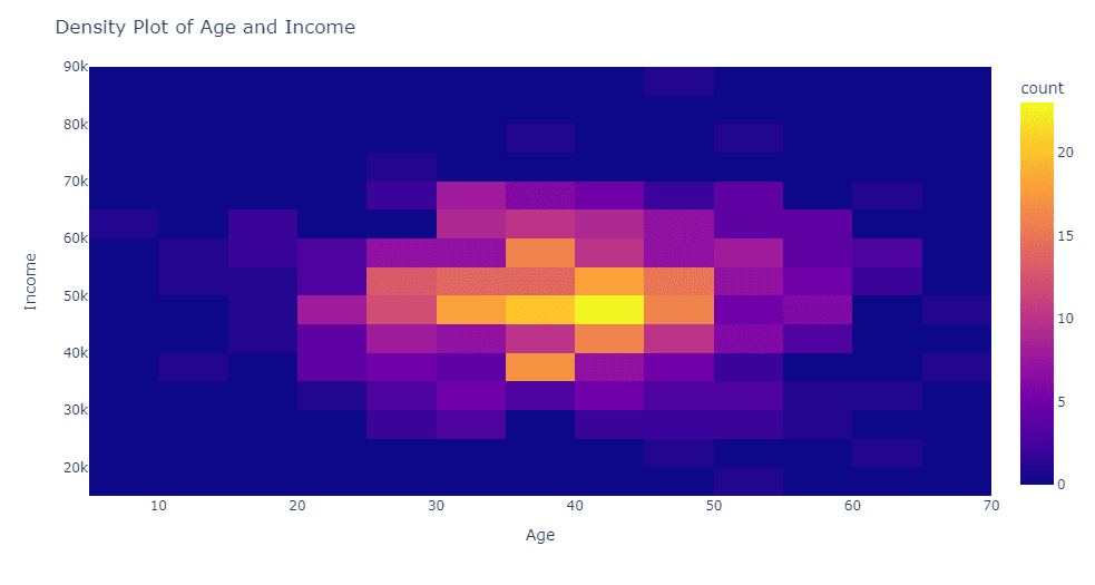
2-D Density Plot: A 2-D density plot extends the concept of a 1-D density plot to two continuous variables. It displays the joint probability density of these variables. For example, let’s say you’re looking at a blog post comparing the relationship between people’s age and their income. A 2-D density plot would show you how these two variables interact, revealing areas where certain age-income combinations are more common.
Picture a grid with age on the horizontal axis and income on the vertical axis. The 2-D density plot would display color gradients or contour lines to represent the density of different age-income combinations.
A 2-D density plot is useful for understanding the relationship between two continuous variables. It can help answer questions like:
- Is there a correlation or trend between two variables, such as age and income?
- Are there any patterns or groupings in the data?
- Can we identify regions of high or low density for a combination of two variables?
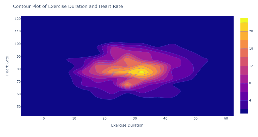
Contour Plot: A contour plot is a specific type of 2-D density plot that uses contour lines to represent the density of data points. These lines connect points with equal probability density. Think of a topographic map that shows elevation: contour lines indicate areas with the same height. In a contour plot, these lines represent areas with the same density of data points.
For instance, imagine a social media post discussing the relationship between daily exercise duration and heart rate. A contour plot could help you visualize areas where certain combinations of exercise duration and heart rate are more common.
A contour plot can answer similar questions to a 2-D density plot but uses contour lines to represent the density of data points. It can help answer questions like:
- What are the areas with equal density in a two-variable relationship, such as exercise duration and heart rate?
- Can we visualize the distribution of two continuous variables in a clear and concise manner?
- Are there distinct regions or boundaries between different density levels?
To illustrate this, imagine a grid with exercise duration on the horizontal axis and heart rate on the vertical axis. The contour plot would use lines to connect points with the same density of data, forming shapes that indicate areas where certain combinations of exercise duration and heart rate are more prevalent.