Hey, friends! Today, we’re going to talk about charts that are best for exploring relationships in your data. 📈
So, what charts should you use? 🤔
There are a few different charts that can help you explore relationships in your data: scatterplots, bubble charts, line charts, and heatmaps. Let’s dive into each one. 🔍
Scatterplots
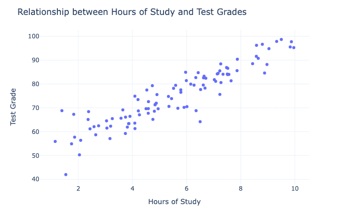
Scatterplots are great for exploring the relationship between two variables. You can see how the data points are distributed and whether there’s a correlation between the two variables. 🤝
For example, you can use a scatterplot to see if there’s a relationship between the amount of time you spend studying and your test scores. 🤓
Bubble Charts
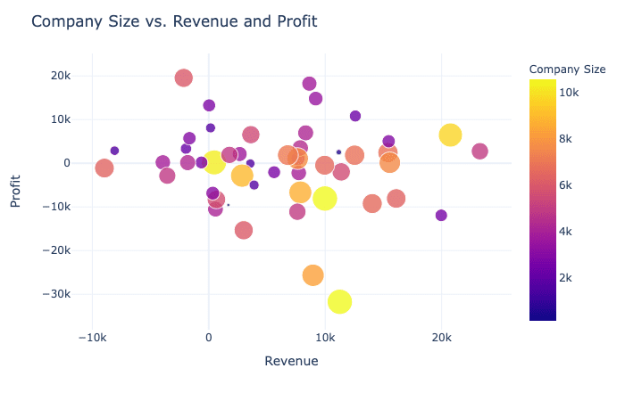
Bubble charts are similar to scatterplots, but they also include a third variable. You can use bubble charts to explore how the third variable affects the relationship between the two main variables.
For example, you could use a bubble chart to see how the size of a company affects the relationship between revenue and profit. 💰💼
Line Charts
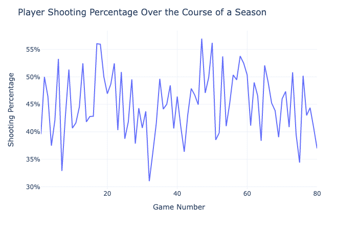
Line charts are great for showing trends over time. You can use them to explore how a variable changes over time and whether there are any patterns or trends.
For example, you could use a line chart to see how your basketball shooting percentage changes over the course of a season. 🏀
Heatmaps
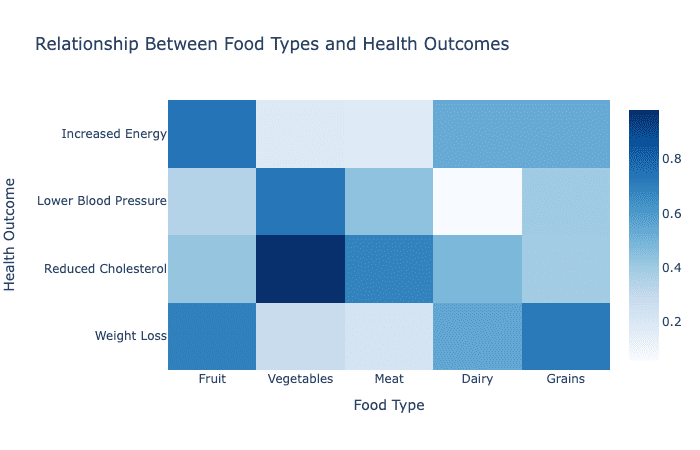
Heatmaps are great for exploring relationships between multiple variables. You can use them to see how different variables are related to each other and whether there are any patterns.
For example, you could use a heatmap to see how different types of food are related to different health outcomes. 🥗🏥
So there you have it, friends! Scatterplots, bubble charts, line charts, and heatmaps are all great for exploring relationships in your data. 📊📈 Which one will you use? 🤔