In this article, we’re going to talk about an amazing tool for visualizing data called box plots, or sometimes, box and whisker plots. They are incredibly useful for understanding how data is distributed and spotting trends in data sets. And guess what? You’ve probably seen them in news articles, blog posts, or social media without realizing it!
Imagine you’re reading an article about the prices of houses in different neighborhoods. It’s hard to compare just by looking at a list of numbers, right? That’s where box plots come in handy! They give you a snapshot of the data in a visually appealing way that’s easy to understand.
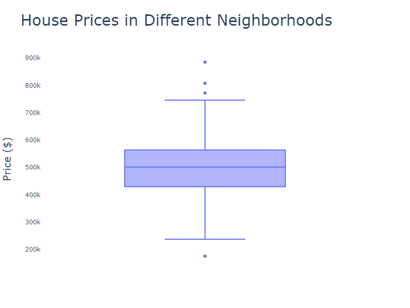
So, what makes up a box plot? It’s a rectangular box with lines (or whiskers) extending from top to bottom. Here’s a quick breakdown of the components of a box plot:
- The box itself represents the middle 50% of the data. The bottom edge (first quartile) is the 25th percentile, and the top edge (third quartile) is the 75th percentile. So, 50% of the data falls within this box.
- The line inside the box is the median, or the middle value, which is the 50th percentile. This line divides the box into two parts, showing you where the middle of the data is.
- The whiskers extend from the box to the minimum and maximum values within 1.5 times the Interquartile Range (IQR). The IQR is the difference between the third and first quartiles – basically, it’s the range of the middle 50% of the data.
- Any data points outside the whiskers are considered outliers and are usually represented as individual dots or symbols.
Box plots can help answer questions about a single data series, such as:
- What is the median (central tendency) of the data?
- What are the first quartile (Q1, 25th percentile) and third quartile (Q3, 75th percentile), and what is the interquartile range (IQR = Q3 – Q1)?
- Are there any potential outliers in the data, and if so, how extreme are they?
- What is the overall spread or range of the data (minimum and maximum values)?
Now let’s talk about grouped box plots. These are simply multiple box plots placed side by side, allowing you to compare different groups or categories within the same chart. Imagine you want to compare house prices across multiple neighborhoods. A grouped box plot will show each neighborhood’s data as its own box plot, lined up next to each other. This makes it super easy to compare the medians, IQRs, and even outliers between neighborhoods at a glance.
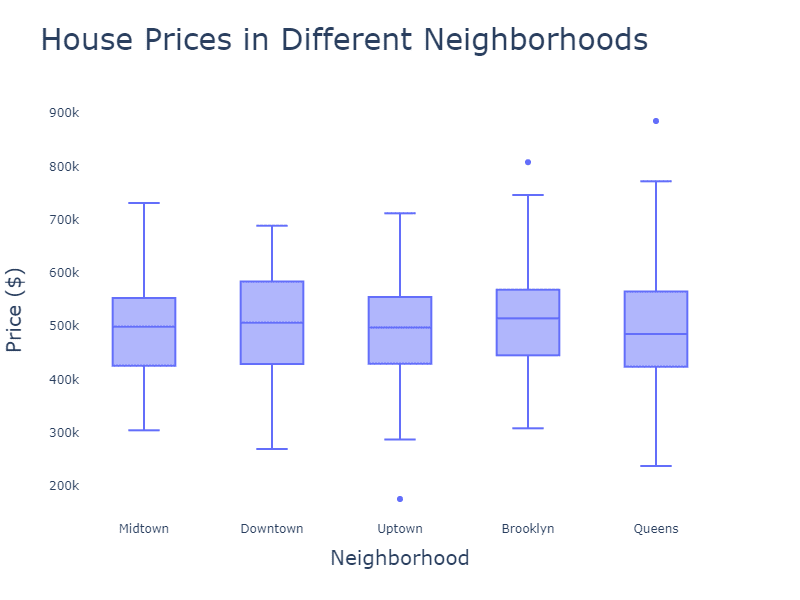
Grouped box plots are suitable for answering questions about multiple data series, often across different categories or groups, such as:
- How do the distributions of different groups (e.g., product types, age groups, or regions) compare in terms of central tendency, spread, and overall shape?
- Are there any differences between the groups in the medians, quartiles, or IQRs?
- Are there any potential outliers within or across the groups, and how extreme are they?
- How does the overall spread or range of the data vary between the groups?