A choropleth is a super interesting way to visualize data on a map. If you’ve ever seen a map with different regions colored in various shades to represent some kind of data, that’s a choropleth map! They are great for showing how a particular value, such as population density or income, varies across geographic areas.
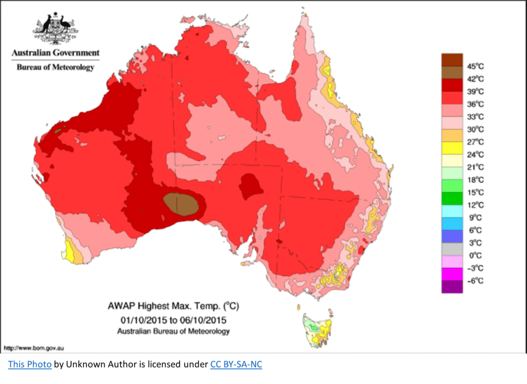
Imagine you’re scrolling through your social media feed, and you come across a map of Australia with each region colored differently based on the highest max temperature in a given time period. The lighter colors represent cooler temperatures, while darker shades represent higher temperatures. That’s a classic example of a choropleth map.
A choropleth can answer questions such as:
- How is a specific variable distributed across different geographic regions?
- Which regions have higher or lower values for a particular variable?
- Are there any geographic patterns or trends in the data for the variable of interest?
Now, let’s break down how a choropleth works. First, you need a geographic area to display the data, like countries, states, or counties. Next, you need the data, usually a number or a percentage. Finally, you need a color scale to represent the range of values in your data.
To create a choropleth, you’ll:
- Divide the geographic area into regions.
- Assign a color to each region based on the data value for that region.
- Display the map with the colored regions to make it easy for your audience to see patterns and trends.
Let’s say you’re looking at a blog post about life expectancy around the world. The author might include a choropleth map with countries colored according to their average life expectancy. The countries with lower life expectancies might be shaded with a lighter color, while those with higher life expectancies are shaded darker.
Another example could be a news article about voter turnout in a recent election. The map might show different states or counties shaded based on the percentage of eligible voters who cast their ballots. In this case, the darker the shade, the higher the voter turnout.
Choropleth maps are a great way to make complex data more accessible and engaging for a wide audience. Next time you come across a map with colored regions, remember that it’s called a choropleth, and think about the story it’s trying to tell!