In this article, we’re going to talk about flow maps, a super useful type of visualization that can help us understand complex data in an engaging and informative way.
Picture this: you’re scrolling through your social media feed or browsing news articles, and you come across an image that shows the movement of people, goods, or information from one location to another. That, my friend, is a flow map!
Flow maps are excellent tools for presenting data involving geographical movement or connections between locations. They use lines, arrows, or even color gradients to represent the flow of something from one place to another. The thickness, length, and color of these lines or arrows can illustrate the quantity or intensity of the flow.
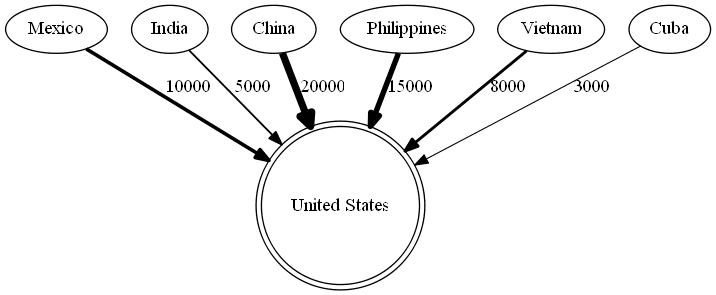
Imagine you’re looking at a map that shows the migration of people from various countries to the United States. In this case, the flow map might use arrows starting from the origin countries and pointing towards the US. The thickness of these arrows would represent the number of people moving from each country, making it easy to see which countries have the most significant migration flows.
Or, consider a map that displays the spread of a viral outbreak, like the COVID-19 pandemic. The flow map could use color-coded arrows or lines to show the movement of the virus from one region to another. The intensity of the color could represent the number of cases, helping you quickly identify areas with high infection rates.
Flow maps can answer questions such as:
- What is a variable’s spatial movement or flow (e.g., people, goods, or information) between locations?
- Are there any patterns, trends, or concentrations in the movement or flow of the variable?
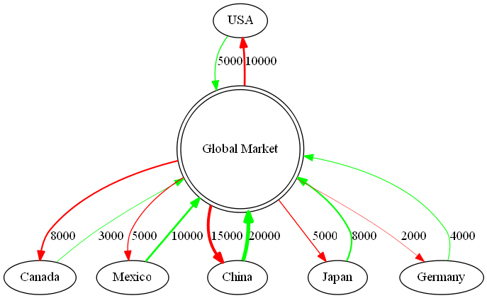
Now, let’s say you’re interested in the global trade of a specific product, like smartphones. A flow map can help you visualize the export and import of these devices between countries. The lines connecting different countries would show the direction of trade, and their thickness would indicate the volume of smartphones being traded.
As you can see, flow maps are a fantastic way to make complex data more accessible and engaging, helping us understand crucial information about the world around us.