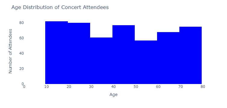
A histogram is a chart that represents the distribution of a dataset. It’s an excellent way to visualize data and get a sense of its overall shape, and it can help us see patterns that might not be apparent in raw numbers. The data is divided into bins (or intervals), and the height of the bars represents the frequency (or count) of data points within each bin.
Imagine you’re scrolling through social media and coming across a post about the ages of people attending a concert. A histogram could be a great way to visualize this information! For example, the x-axis could represent age groups like 0-9, 10-19, 20-29, and so on, while the y-axis represents the number of attendees in each age group. The taller the bar, the more people in that age group.
Histograms can answer questions such as:
- What is the distribution of values for a continuous variable?
- Are there any notable patterns, trends, or outliers in the data?
Now, let’s move on to stem-and-leaf plots. These are another way to visualize data distribution, but they also show the individual data points. The data is separated into stems (the leading digit) and leaves (the trailing digit) in a stem-and-leaf plot.
Let’s use the same concert example. Suppose we have the weight of 9 concert attendees (in pounds): 167, 173, 173, 174, 177, 178, 183, 183, and 185. A stem-and-leaf plot for this data would look like this:
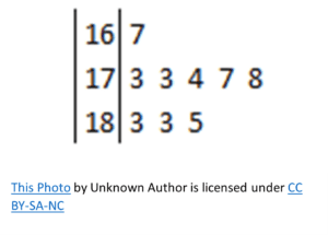
Here, the stems are on the left (16 for pounds 160-169, 17 for pounds 170-179, and so on), and the leaves are on the right. You can easily see the distribution of ages and even identify the individual ages of the concert attendees.
Stem-and-leaf plots can answer questions such as:
- How are values for a single variable distributed?
- Can any patterns, trends, or outliers be identified in the data?
Now, imagine you’re reading a blog post about the running times of people in a local 5k race. A stem-and-leaf plot could show the distribution of finishing times, with stems representing the minutes and leaves representing the seconds. This would give you an idea of how fast most people completed the race and whether there were any outliers.
In summary, histograms and stem-and-leaf plots are fantastic tools for understanding data distributions. Histograms use bars to show frequencies, while stem-and-leaf plots display individual data points.