In this article, we’re going to talk about an interesting and beautiful type of chart called a sunburst chart. You might have come across one of these in a news article, blog post, or social media and wondered what it’s all about.
A sunburst chart is a circular, hierarchical data visualization. It’s kind of like a combination of a pie chart and a tree diagram. The chart has multiple concentric circles, each representing a level of the hierarchy. The innermost circle is the top level, and as we move outward, we get deeper into the hierarchy.
Sunburst charts can answer questions such as:
- How are different categories or items hierarchically organized and related?
- What are the proportions or sizes of categories or items at different levels of the hierarchy?
- Are there any notable patterns or trends in the data across hierarchical levels?
Let’s use a simple example to help illustrate this concept. Imagine we’re looking at a sunburst chart that shows the sales number across Canada. In this case, the innermost circle would represent the different Canadian territories sales as a whole. The next circle would be divided into segments, each representing a different purchaser group, like corporate or home office. Then, each of these segments would be further divided into smaller segments in the outermost circle, representing different purchased items, like office supplies or furniture.
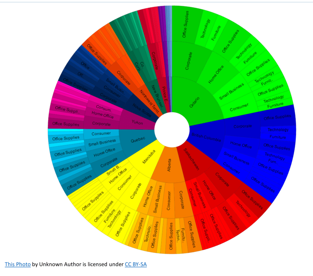
As you can see, the sunburst chart is great for visualizing data with multiple levels of categorization. It makes it easy to compare the sizes of different segments and understand the overall structure of the data.
Now, let’s talk about the color in a sunburst chart. Colors are often used to represent different categories or groups. For example, in our smartphone market share example, Apple could be represented in blue, Samsung in green, and Huawei in red. The different shades of these colors can be used to represent subcategories or individual models.
One thing to keep in mind when reading a sunburst chart is that the area of each segment is proportional to the value it represents. This makes it easy to visually compare different segments and get a sense of their relative importance.
Sunburst charts are useful for various purposes, such as understanding the composition of a population, exploring the distribution of market shares, or even visualizing the structure of a website. They’re great for making complex data more accessible and engaging for a wide audience.