What does Anscombe’s quartet teach us about the importance of visualizing data instead of relying on summary statistics when exploring data?
Anscombe’s quartet is a set of four datasets that have nearly identical summary statistics but very different visual patterns. This teaches us the importance of visualizing data instead of relying solely on summary statistics when exploring data. 📈👀
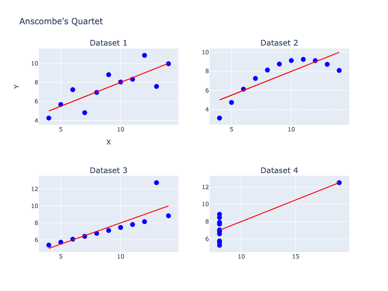
👉 Imagine you’re in a class, and the teacher tells you that the average grade on a test is a B. This summary statistic doesn’t tell you much about how well the class did overall or how many students got each grade. Similarly, summary statistics can’t tell us everything about the relationship between two variables.
👉 For example, let’s say we’re studying the relationship between the age of a car and its Miles Per Gallon (MPG). We could calculate the correlation coefficient or other summary statistics, but these don’t tell us anything about the actual pattern of the relationship. By visualizing the data in a scatterplot, we can see if the relationship is linear or nonlinear, if there are any outliers, or if there are other factors at play.
Visualizing data can also help us identify errors or inconsistencies in our data. For example, if we see a scatterplot with a perfect linear relationship, this might indicate that the data is too good to be true and needs to be double-checked.
📊 Understanding the importance of visualizing data can help us make better decisions and avoid making incorrect assumptions based on summary statistics alone. So next time you’re analyzing data, think like an artist and create a visualization to see the patterns in your data! 🧐🎨