Hey, friends! Today, we’re talking about scatterplots and how they can be used to explore data. 📈
So, what does a scatterplot display?
A scatterplot displays data point pairs and the relationship between two variables. It shows how one variable changes in relation to the other variable. 🔍
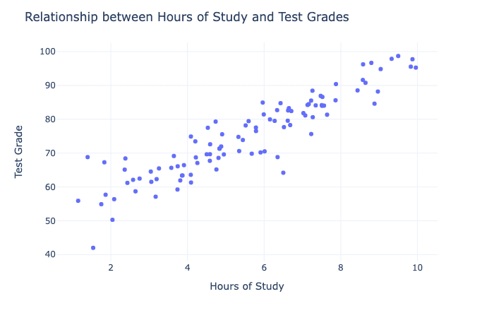
For example, let’s say you’re looking at a scatterplot that shows the relationship between hours of study and the grade on a math test. The scatterplot displays each data point pair, with hours of study on the x-axis and the grade on the y-axis. 📊
Scatterplots are good for showing trends in the data and maintaining the accuracy of individual variables. They allow you to see the relationship between two variables and how they interact with each other. Scatterplots can also help you identify outliers or unusual data points. 🔍
For example, let’s say you’re looking at a scatterplot that shows the relationship between the price of a product and the number of units sold. The scatterplot can show you if there’s a trend between the price and the number of units sold, and if there are any unusual data points that need to be investigated further. 💰📈
You can explore a third variable in a scatterplot by using different shapes, colors, or sizes for the data points. For example, you could use different colors to represent different groups of people, or different shapes to represent different types of products. This can help you see how the third variable interacts with the relationship between the two variables in the scatterplot. 🎨
It’s best to use a scatterplot with a small dataset because it can become difficult to interpret when there are too many data points. The scatterplot can become cluttered, and it can be difficult to identify patterns in the data. Additionally, the larger the data size, the longer it takes to construct a scatterplot. This is because each data point needs to be plotted on the graph, and more data points means more time to plot them. 🔍
So there you have it, friends! Scatterplots display data point pairs and the relationship between two variables. They’re good for showing trends and maintaining the accuracy of individual variables. You can explore a third variable by using different shapes, colors, or sizes for the data points. It’s best to use a scatterplot with a small dataset to avoid clutter, and the data size impacts how long it takes to construct a scatterplot. 🤓📊🔍